Math in… Map Projections
When designing a world map, the fact that the world is not flat means you have some choices to make about how to translate Earth’s curved surface into a flat image. Each of those choices has some things it gets right and things it gets wrong, so choosing a projection depends on what you need the map for!
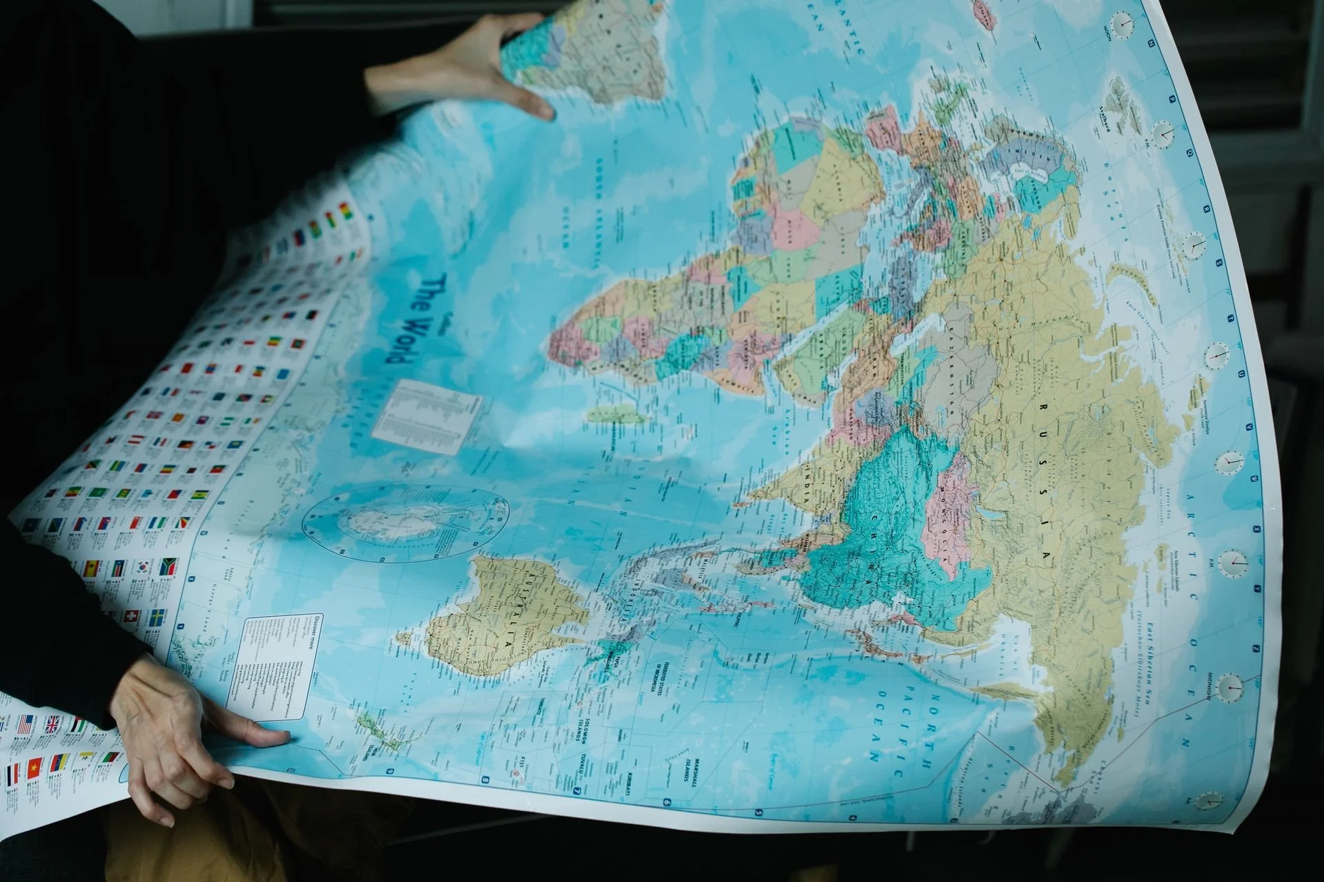
A map of the world. (Image source: Lara Jameson, via pexels.com)
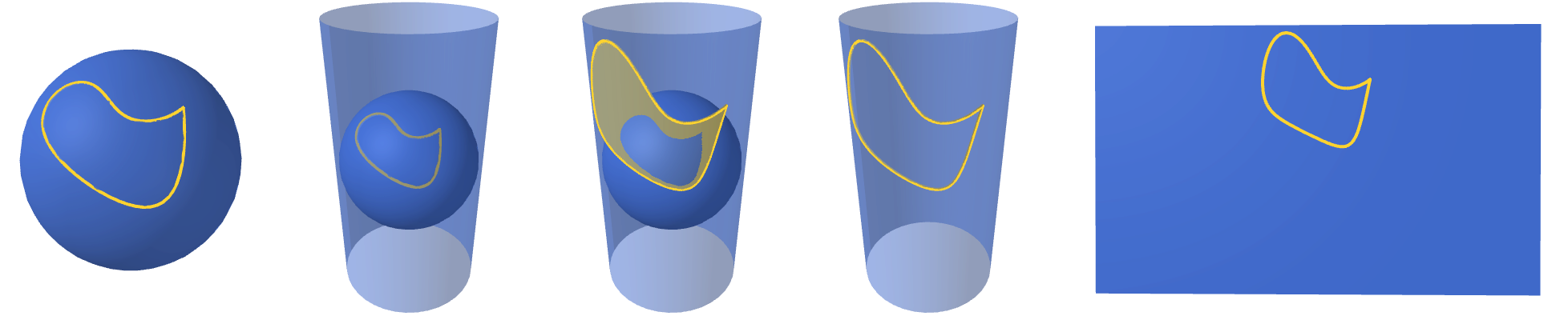
One way to create a map is to start by placing the globe in a cylinder. Wherever you position yourself, if you look at the center of the globe, your line of sight will pass through a point on the globe along the way. Chances are it will also pass through a point on your cylinder. For each point on the globe, we’ll draw it at that corresponding point on the cylinder, if it exists. We can then cut the cylinder and unroll it to get our map.
Here’s how we can think about mapping a continent, represented by its outline:
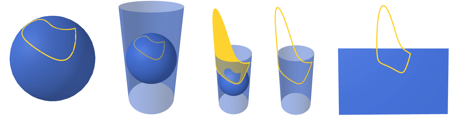
Our continent might look a little different depending where on the globe it lies. Here’s what happens if that exact same continent is closer to the equator:

As you can see, it ended up smaller and less stretched out on the map. The closer to a pole a continent is, the more stretched out it appears on our projection. If it’s too close to the pole, it might end up only partially appearing on the map, since for points near the pole our line of sight to the globe’s center might not pass through the cylinder:
We can make the cylinder taller to accommodate our continent, but if any part of the continent lies on the pole, the map will never be tall enough to contain it!
The map projection method outlined above is the central cylindrical projection. While any map projection is going to distort space, this projection not only stretches things to different sizes but also alters the angles at which curves meet, as you can see by looking at our continent’s cusp in the three different resulting maps.
While neither of those distortions is great, the angular distortion can make navigation based on this map tricky. For this reason, a related map projection called the Mercator projection was introduced, which changes the way that things are stretched as you get further away from the equator. Based on
λ, the longitude
λ₀, chosen central meridian (e.g., the prime meridian)
φ, the latitude
we can create a planar map using Cartesian coordinates x and y if we know how to translate from λ and φ. For our central cylindrical projection, the coordinates end up being
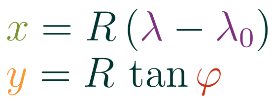
where we interpret latitude and longitude in radians. For the Mercator projection, the tweak to the y-coordinate instead gives us the coordinates
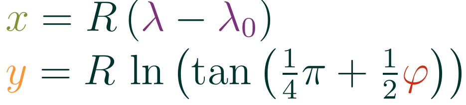
It’s not as pretty, but this provides just the right accompanying distortion to the y-coordinate to make the map projection conformal: if two curves intersection at an angle θ on the globe, then their projections also meet at that angle on the map. This means that if you using a map made with a Mercator projection and it looks like you need to make a 30° turn on the map to stay on course, you can rest assured that actually corresponds to a 30° turn on the globe.
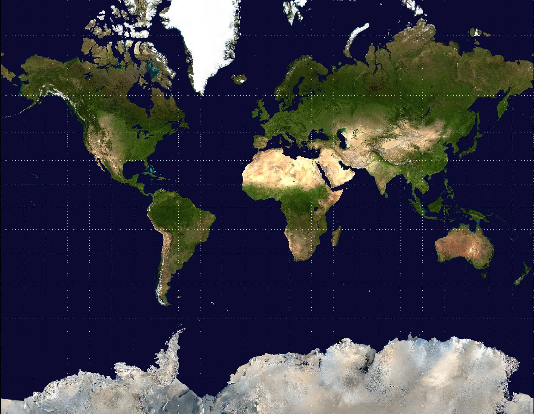
Mercator projection based on an image from NASA's Earth Observatory "Blue Marble" series. (Image source: mdf, via Wikimedia)
This projection also has the property that if you travel in a straight line on the map, it corresponds to traveling along a path of constant bearing (i.e., so that a compass needle maintains a constant angle). While such a line segment map the shortest path between two points on the globe, it gives an easy system for planning a path that is easy to stick to using tools that were accessible to sailors in 1569, when Gerardus Mercator made his world map. These paths are called rhumb lines (or loxodromes).
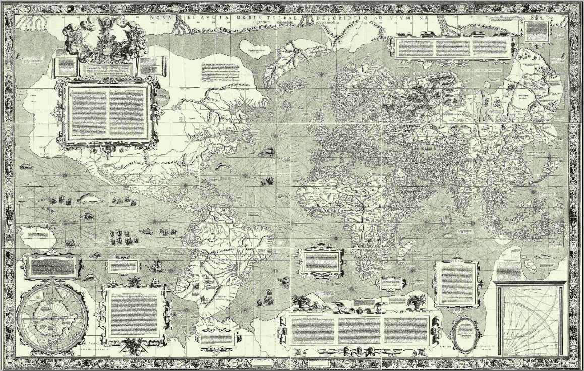
Mercator’s 1569 world map. (Image source: Joaquim Alves Gaspar, via Wikipedia)
While the Mercator projection preserves angles, it still distorts areas — it just distorts them so that horizontal and vertical dimensions are scaled the same amount.
There are projections that preserve areas in the sense that if two regions of the globe have the same area, their projections on a map also have the same area. These can be nice for getting a sense of scale, since many people who have only seen Mercator projections assume Greenland and Antarctica are much larger than they are compared to other landmasses. Here’s one based on mapping to a disk instead of a cylinder:
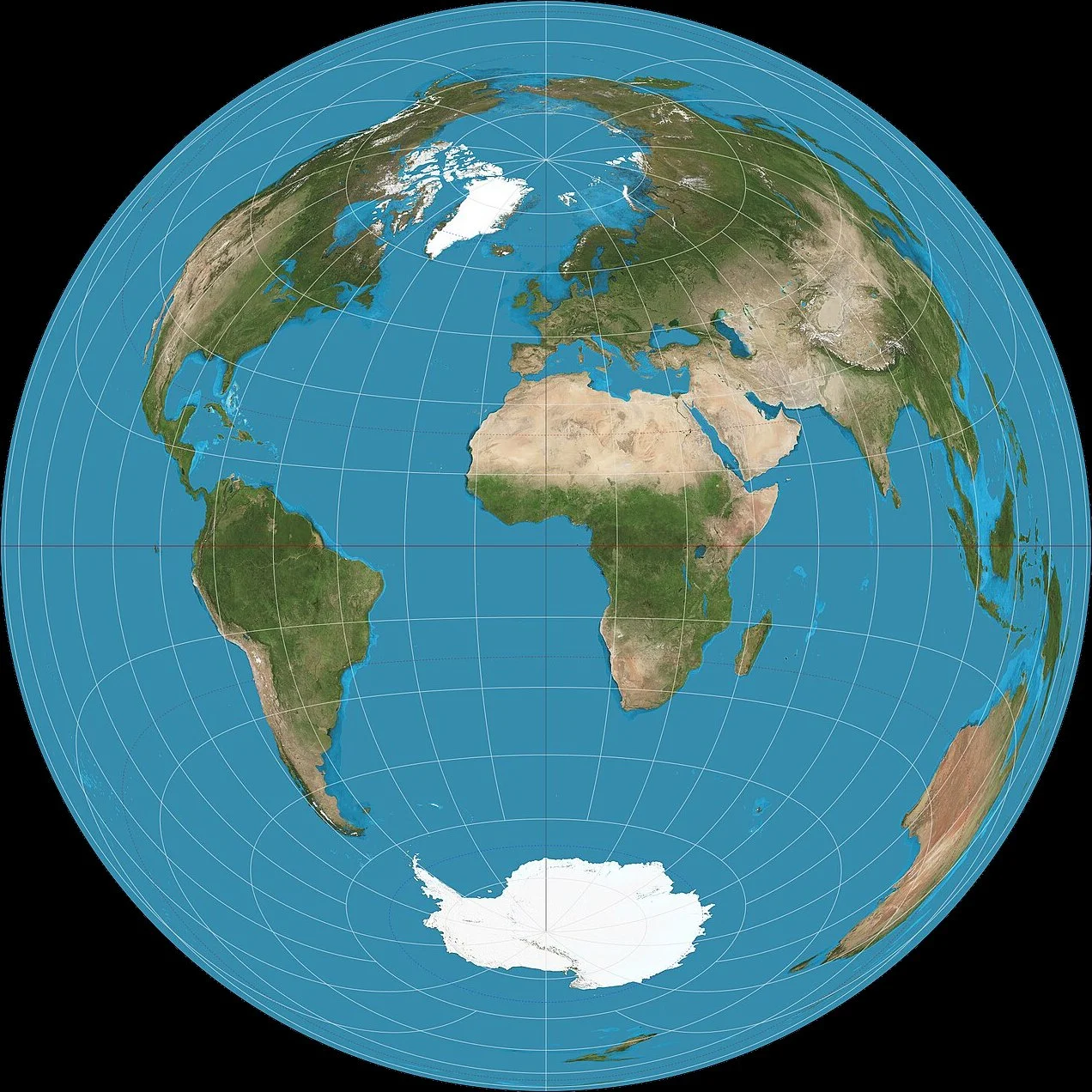
Lambert azimuthal equal-area projection. (Image source: Strebe, via Wikipedia)
It would be nice to have a map that preserves both angles and area, but Leonhard Euler proved that no map projection can be both conformal and equal-area. While that’s an unfortunate turn of events for map enthusiasts, it’s a fascinating fact about a fundamental difference between spheres and planes for math enthusiasts!
What other ways could we represent the world on a map?