
Math in… Misleading Graphs
Consider the two graphs below depicting a house’s electric bill for the past six months.
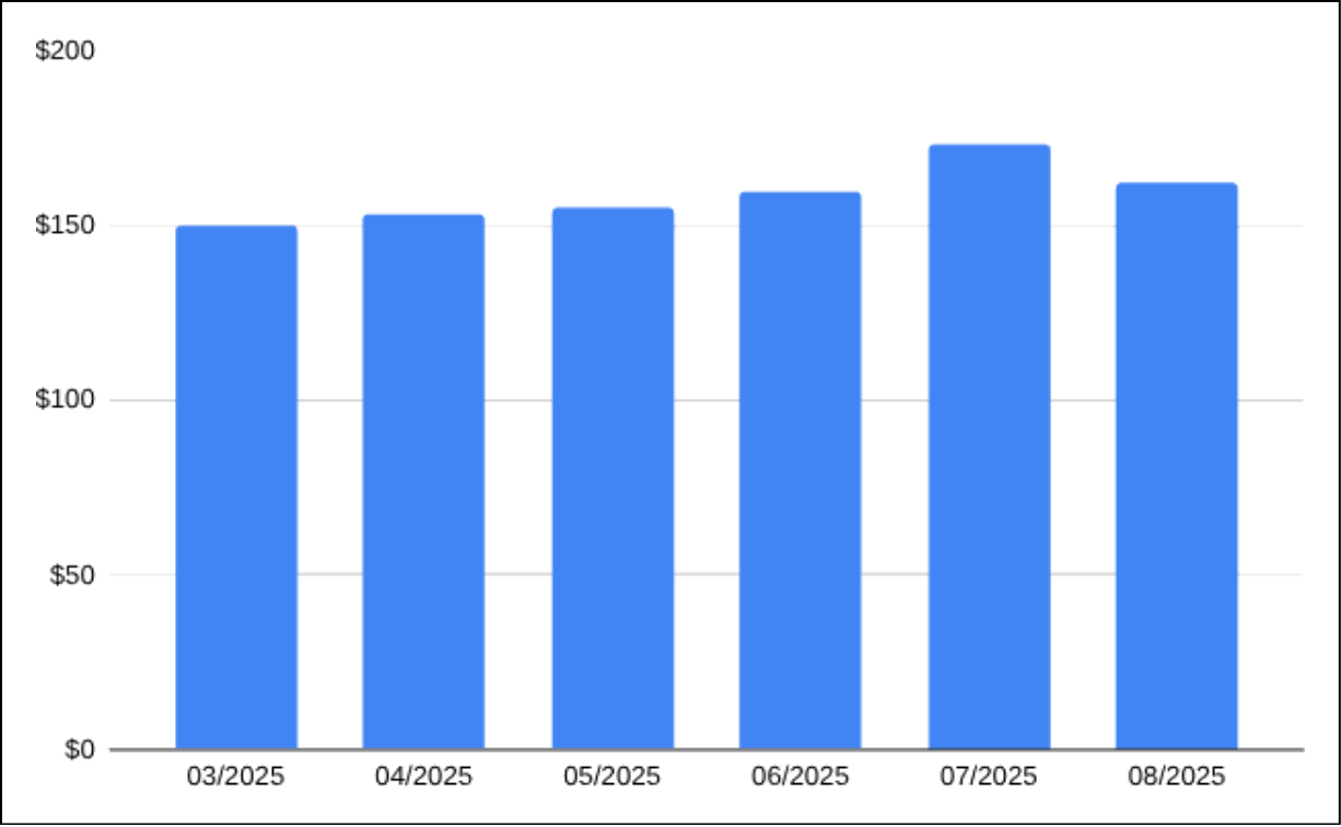
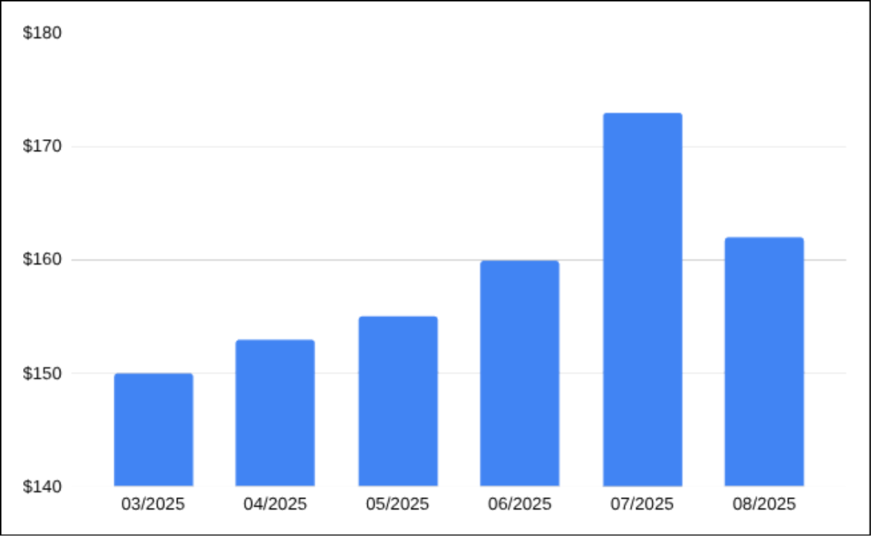
What’s different about these graphs? The two graphs reflect the same data set, but is your reaction to each the same? How might each influence the way you think about July’s bill?
One chart’s vertical axis starts at $0 while the other’s has been truncated to start at $140. If you incorrectly assumed the second one also starts at $0, you would think July’s bill was over three times larger March’s bill. Truncation can be practical, but it can also be used to mislead readers, making small differences appear large.
Another choice that can lead to visual confusion is rendering 2D graphs in 3D. Consider the pie chart below depicting children’s pet preferences:
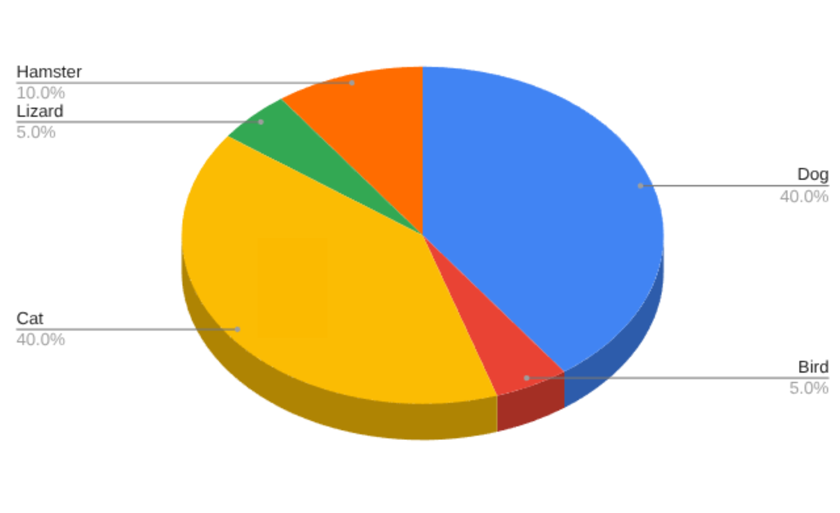
While pie charts can be tough to accurately read, unnecessary 3D perspective can make it much tougher. Do any of the above slices surprise you once you read the percentages?
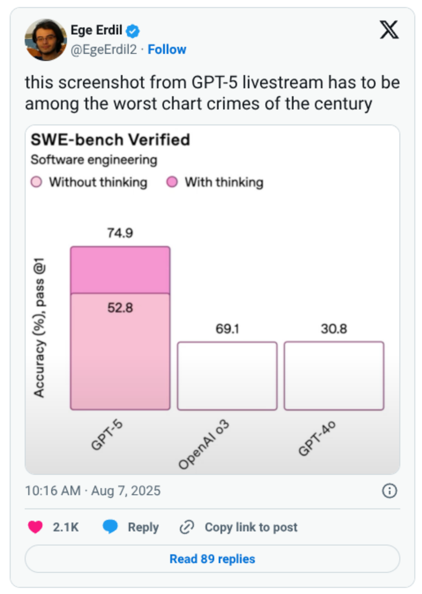
Sometimes graphs are misleading because they are geometrically wrong. You might be able to spot a few issues in this example from last month.
Communicating data is hard work. Even when trying to communicate in a clear and honest way, it’s still possible to present things in a way that might misinform.
It’s our job, both as communicators and audiences, to think about the context of data we’re faced with and decide what story it might tell.
As an audience, this often means giving a chart or graph a second look and deciding whether its first impression was the right impression.
Have you seen a misleading graph in everyday life? What tipped you off?