
What can you tell us about the tiling on the Seattle Storm’s basketball court?
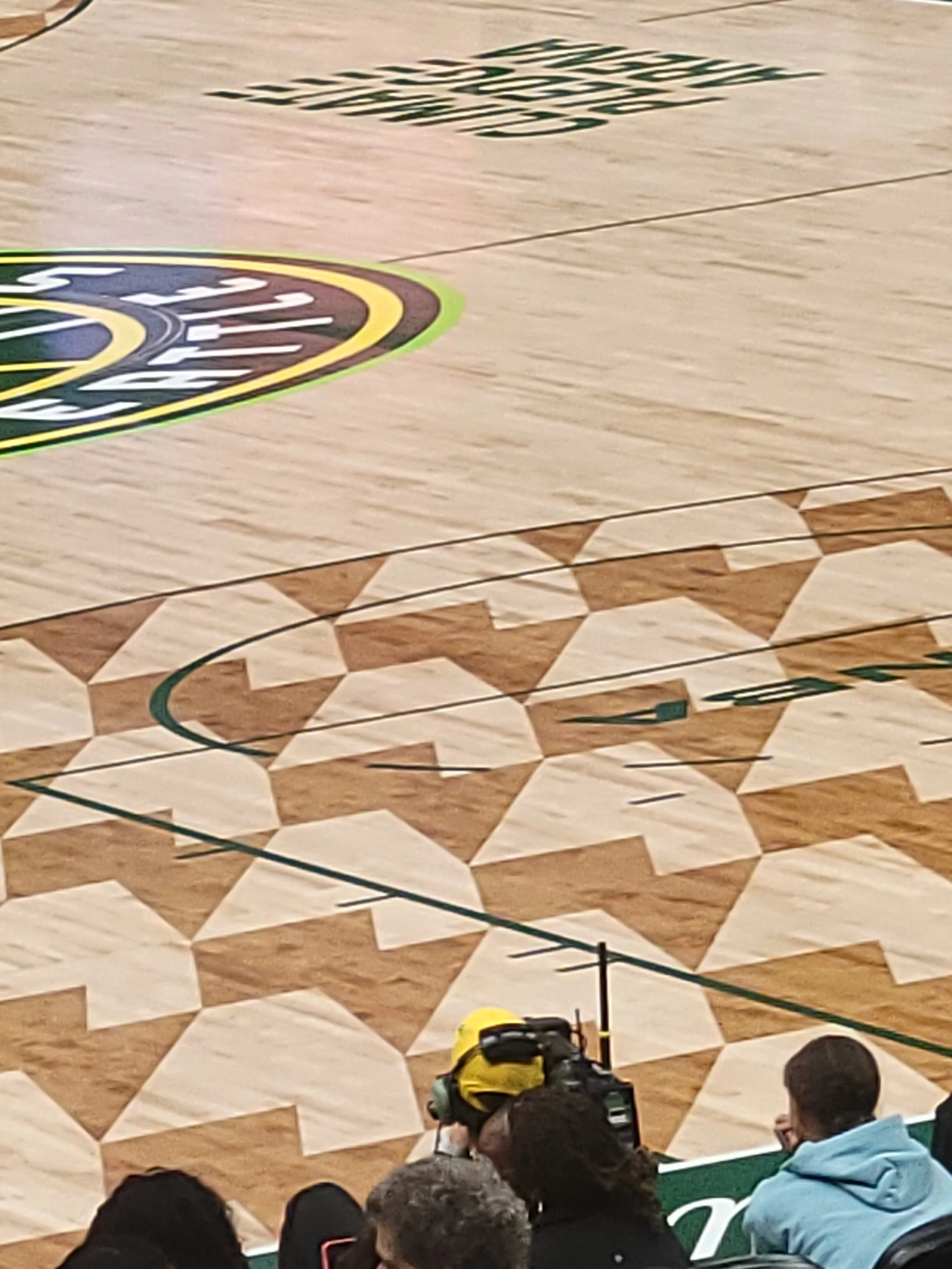
“What can you tell us about the tiling on the Seattle Storm’s basketball court?” — Dan
Thanks for your question, Dan!
It’s much easier to see what’s going on from another angle. Here are some photos by Niko Tamurian from KOMO’s Sneak Peek - Climate Pledge Arena ready to host Seattle Storm:
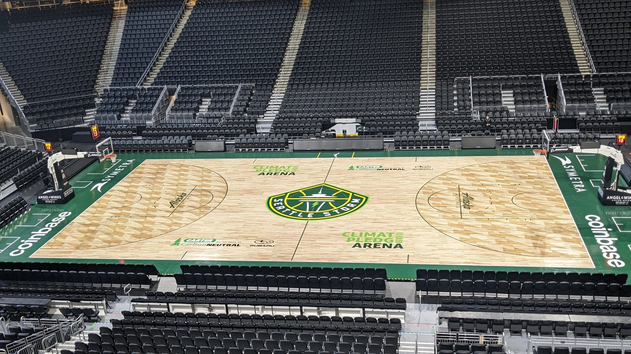
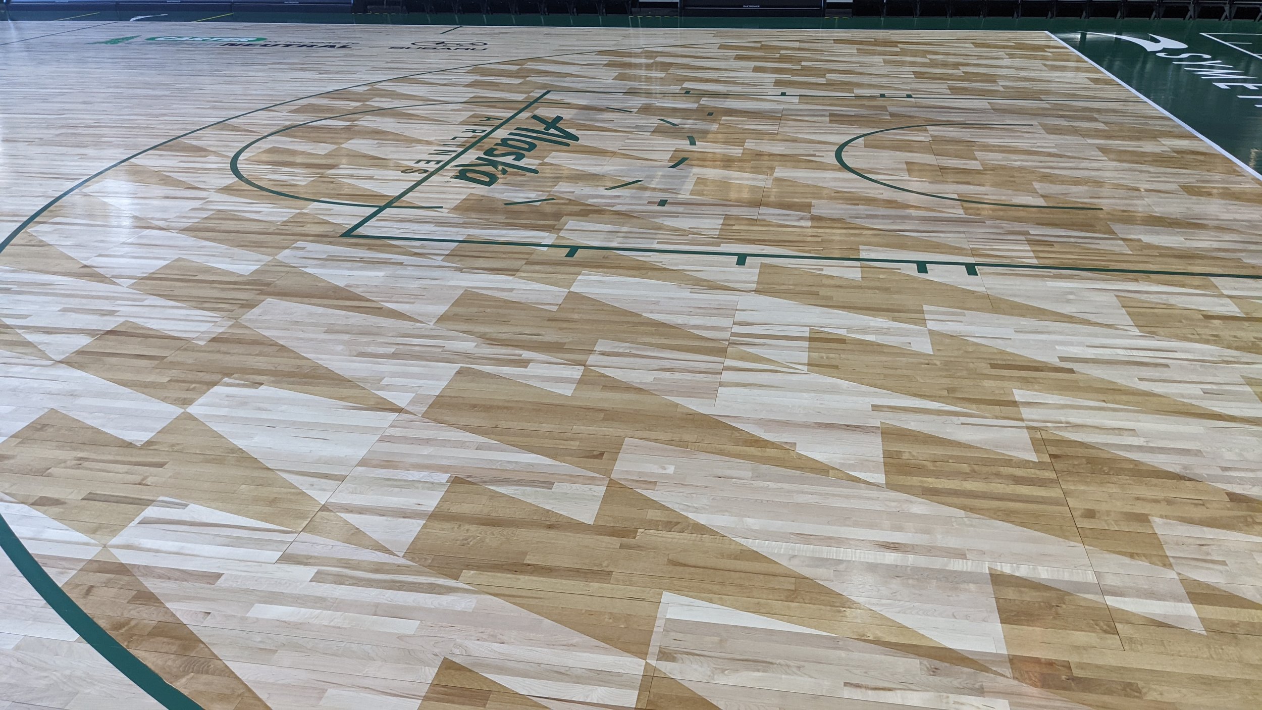
If you look at the middle of the court, you’ll see the Storm’s lightning bolt logo:

Seattle Storm logo, via wnba.com
If we take that light green lightning bolt and tile copies of it on a dark green background so that they touch vertex-to-vertex, one way to do it looks like this:

As far as wallpaper groups, which we looked at in a Math in Real Life this spring, this tiling has group o (p1) since there are the necessary discrete translational symmetries but no rotational, reflectional, or glide symmetries. Here it is again, this time highlighting a parallelogram-shaped fundamental domain:

Unfortunately, these parallelograms make for awkward tiles on desktop and phone backgrounds, which require rectangular patches. If you want to play around with this as a background, here’s a rectangular patch that will tile nicely:

(I find the neon green a little overwhelming to stare at, so you might want to play around with the palette if you do so!)
One thought that occurred to me is that they might have stretched the tiling in some dimension so that it appears to have the proportions above from the perspective of most attendees. Perspective makes squares on the ground appear wider than they are deep, a quirk of perspective called foreshortening. That alone might account for why the lightning bolts appear so short in Dan’s photo. I was wondering whether the bolts in the woodwork had also been physically shortened in that dimension so that they would look more like the image above when viewed from courtside seats. That would make the tiling look extra skewed from Dan’s perspective — and it does look pretty skewed in his photo! I don’t see a great way to tell without measuring or talking to the designer, but I’d guess the skewing we see is just perspective rather than something actually planned in the woodwork.
While poking around for images of the Storm’s court, I found that the BECU Storm Center for Basketball Performance not only has the same tiling on its court, but also has an interesting variant as the backdrop to its reception desk. Here are some photos via ZGF, one of the firms that designed the Center:
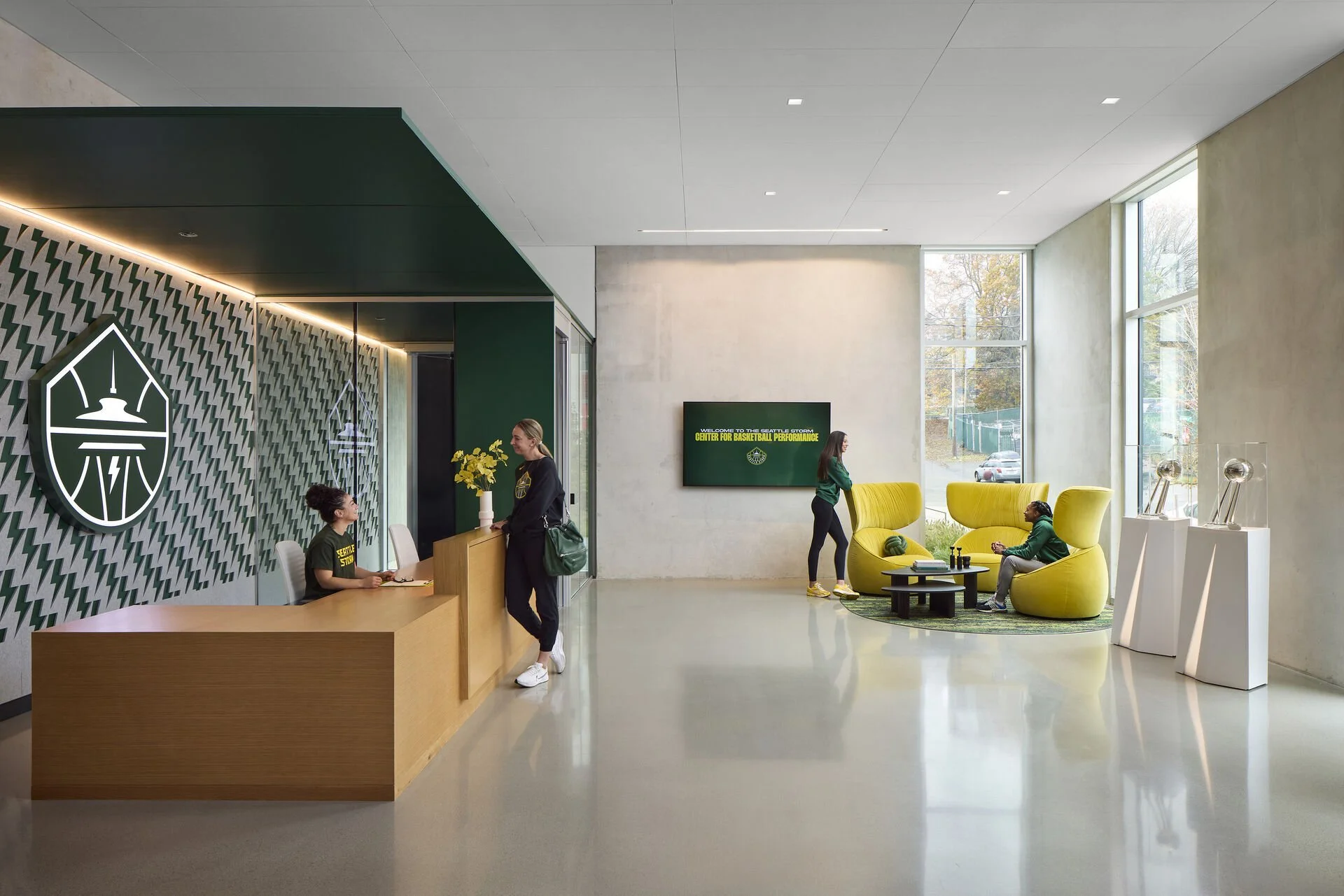
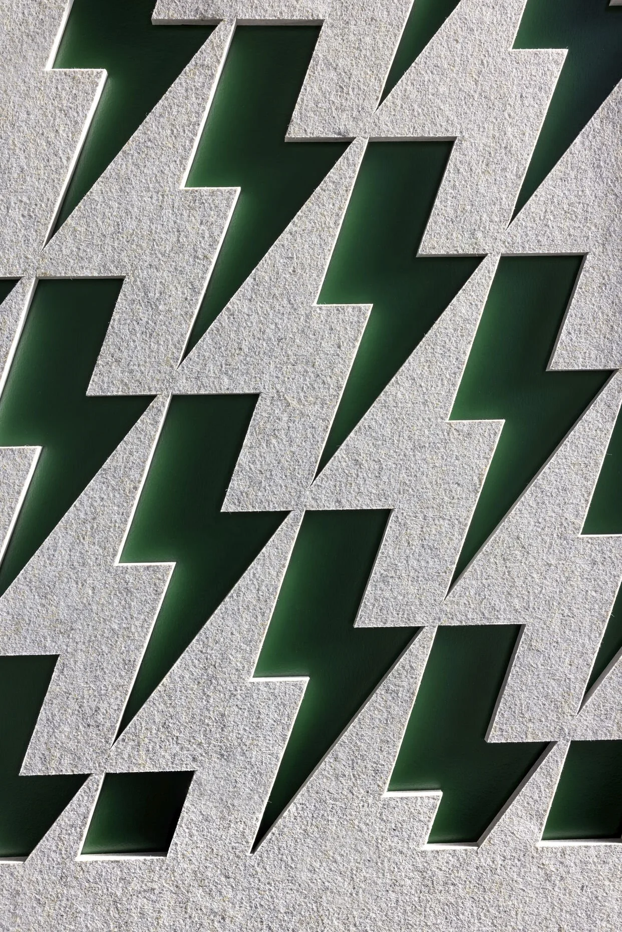
The bolt has been tweaked a little so that certain edges have become parallel, so I guess it’s a lightning bolt and not the Storm’s lightning bolt. I’ll forgive it, though, since having the negative space have the same shape as the positive space is pretty baller. The gray bolts also overlap so that they can form a single piece, which seems like a reasonable practical design tweak. Here’s how it looks if we get rid of that overlap, allowing both colors of bolts to be the same shape:

And here’s a tileable rectangular patch:

If we count the teal and gray bolts as interchangeable, this one gains a 180-degree rotational symmetry swapping teals and grays, giving it wallpaper symmetry group 2222 (p2). (Otherwise, it’s another o (p1).)
Can you find other ways to tile with a lightning bolt?